Good food, good fun.
All day, all night.
All day, all night.
Identity . Art direction . Illustration
Studio: Fortis
Photographer: Liz Keene
Photographer: Liz Keene
Recognition
AGDA 2021, Distinction (Brand identity – small business)
AGDA 2021, Merit (Illustration for design)
Sydney Design Awards 2021, Gold (Illustration)
Sydney Design Awards 2021, Silver (Brand identity)
AGDA 2021, Distinction (Brand identity – small business)
AGDA 2021, Merit (Illustration for design)
Sydney Design Awards 2021, Gold (Illustration)
Sydney Design Awards 2021, Silver (Brand identity)
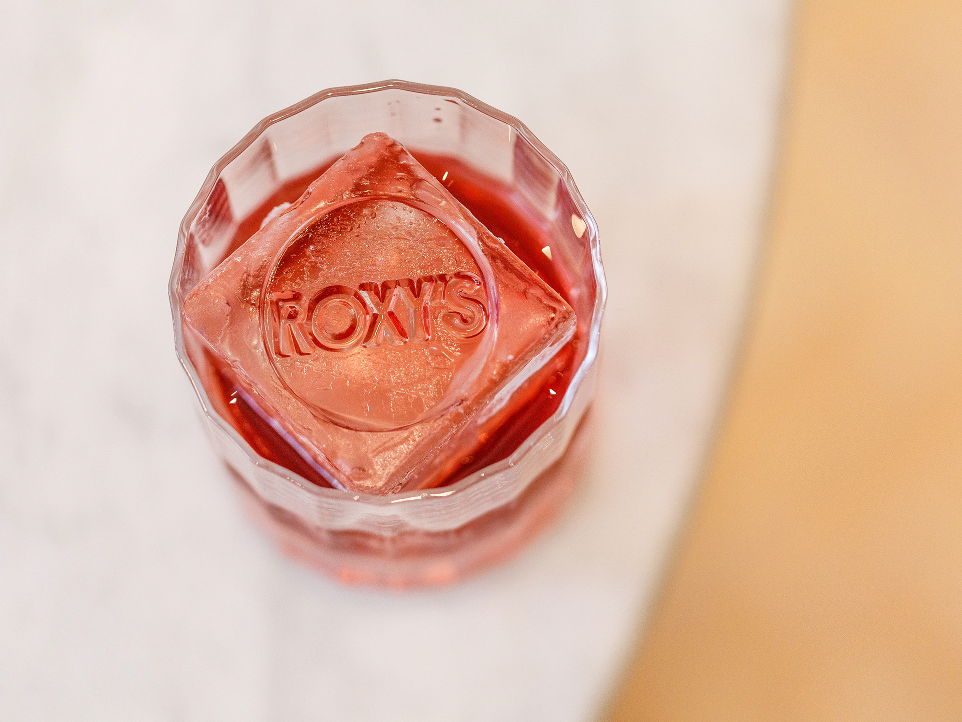
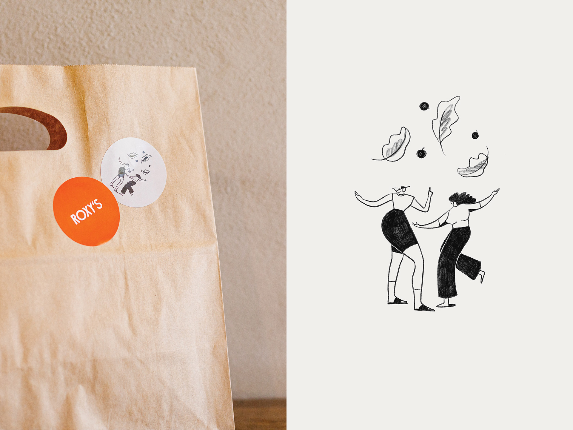
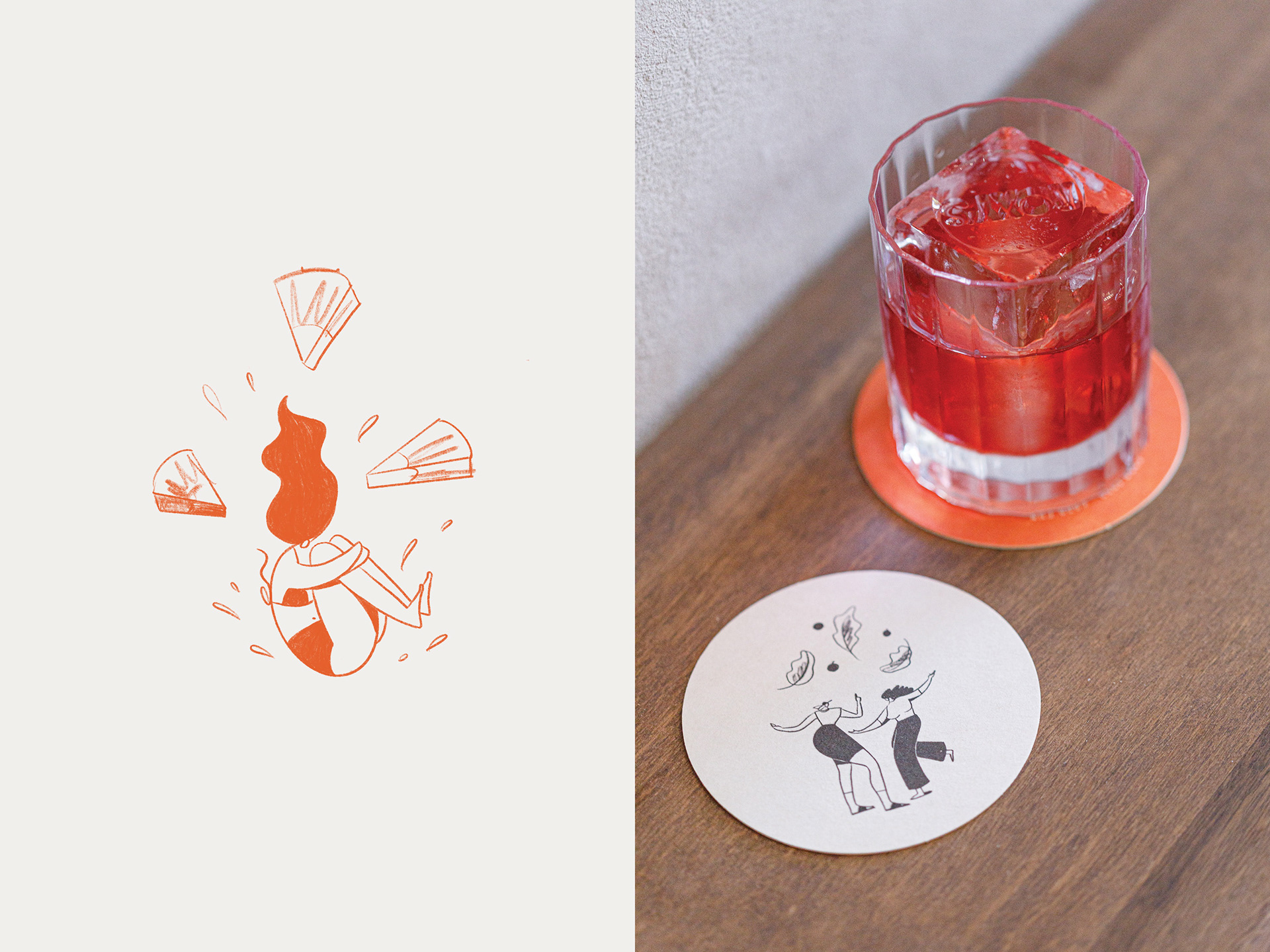
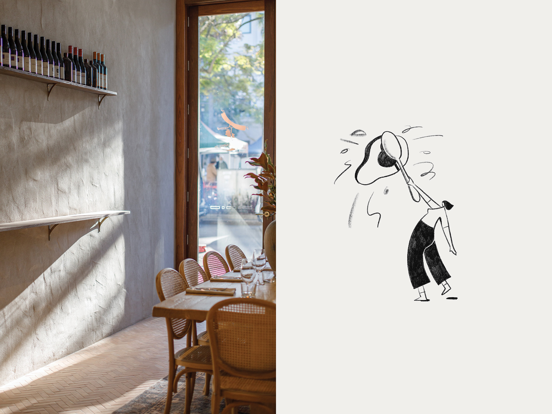
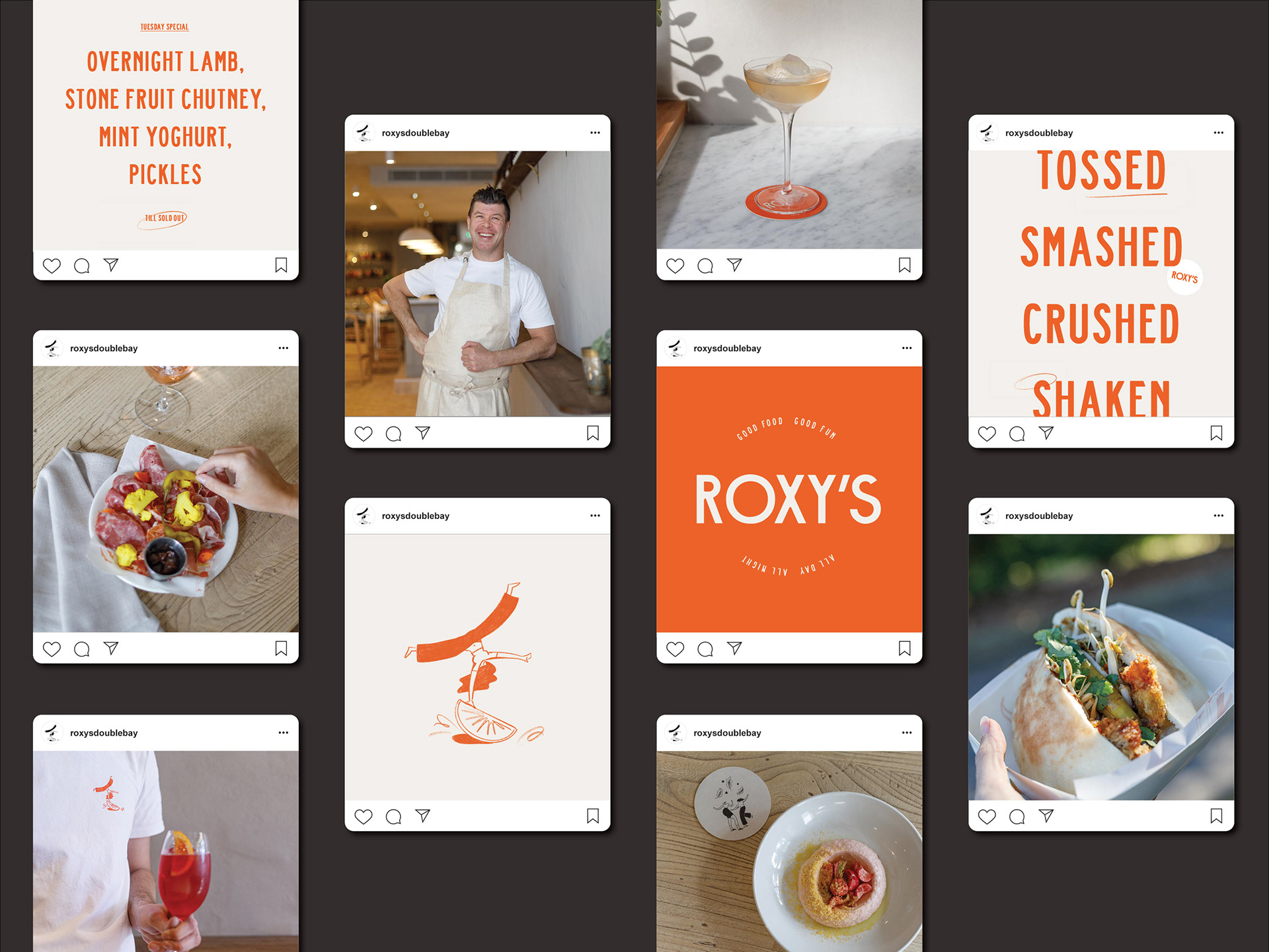
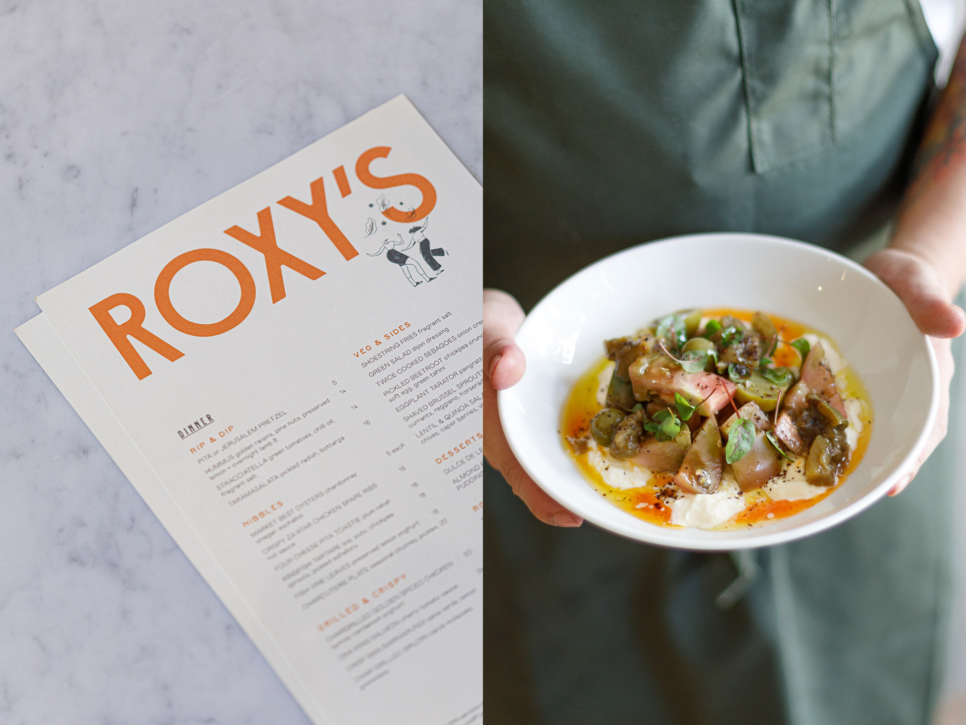
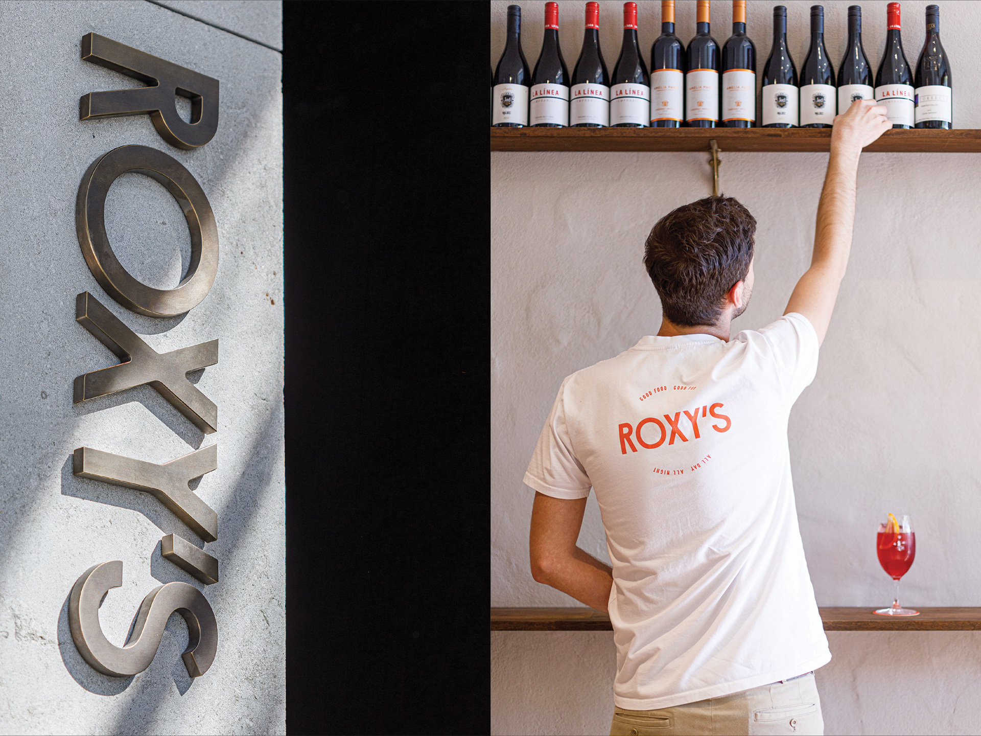
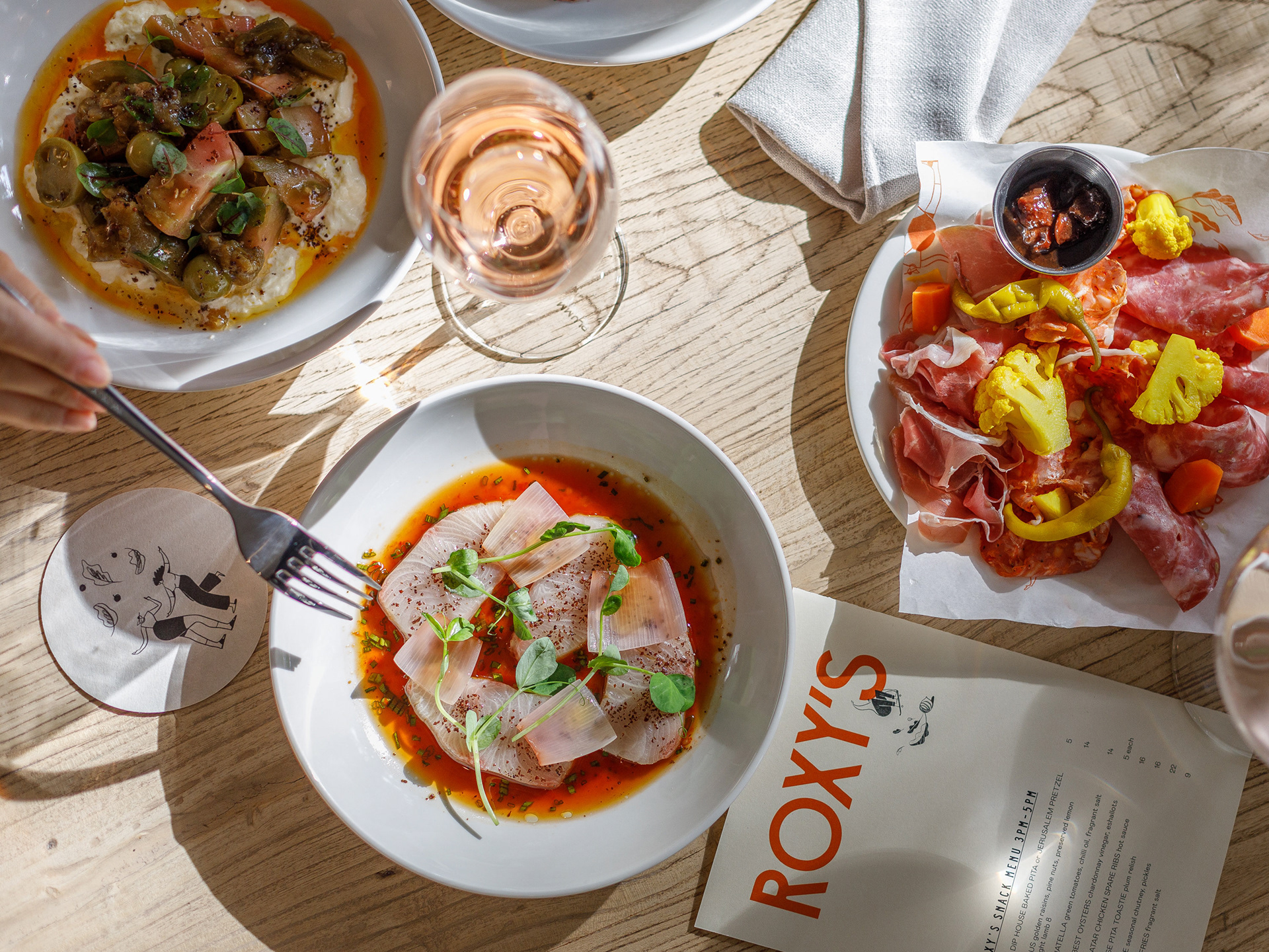
Roxy’s is a vibrant and ambitious new food and drink venue in the heart of Double Bay. The space itself is small. But the energy is large. Reflecting the vision and personality of charismatic owner, Damien Monley, the brief was to create an unforgettable brand for Roxy’s that celebrated this small character with large spirit. The food philosophy draws on Middle Eastern flavours, loaded with spiced up classics. The Roxy’s brand needed to capture all of this and more. All shared through whimsical story-telling and a playful tone that infuses every touchpoint of the Roxy’s experience.
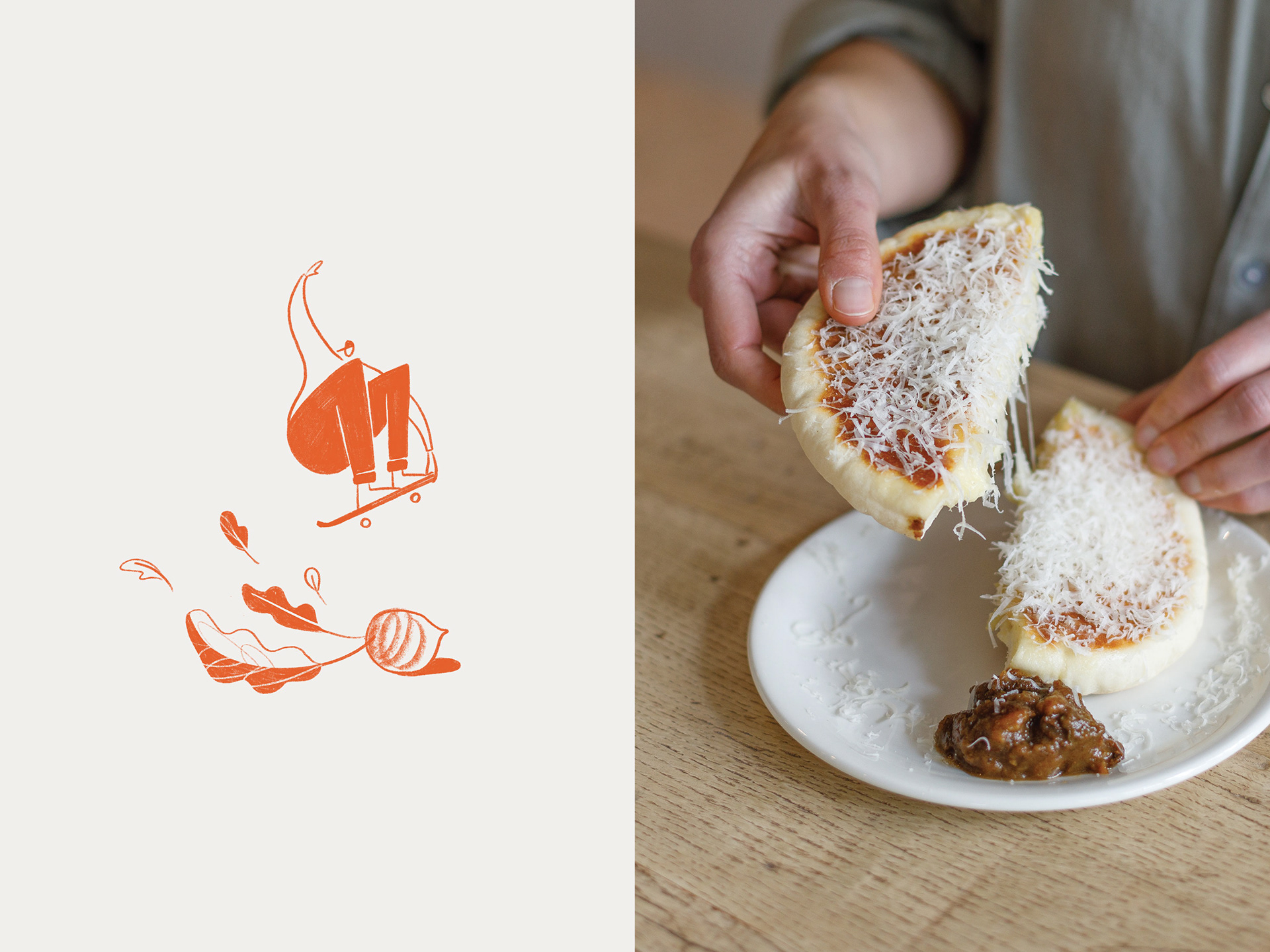
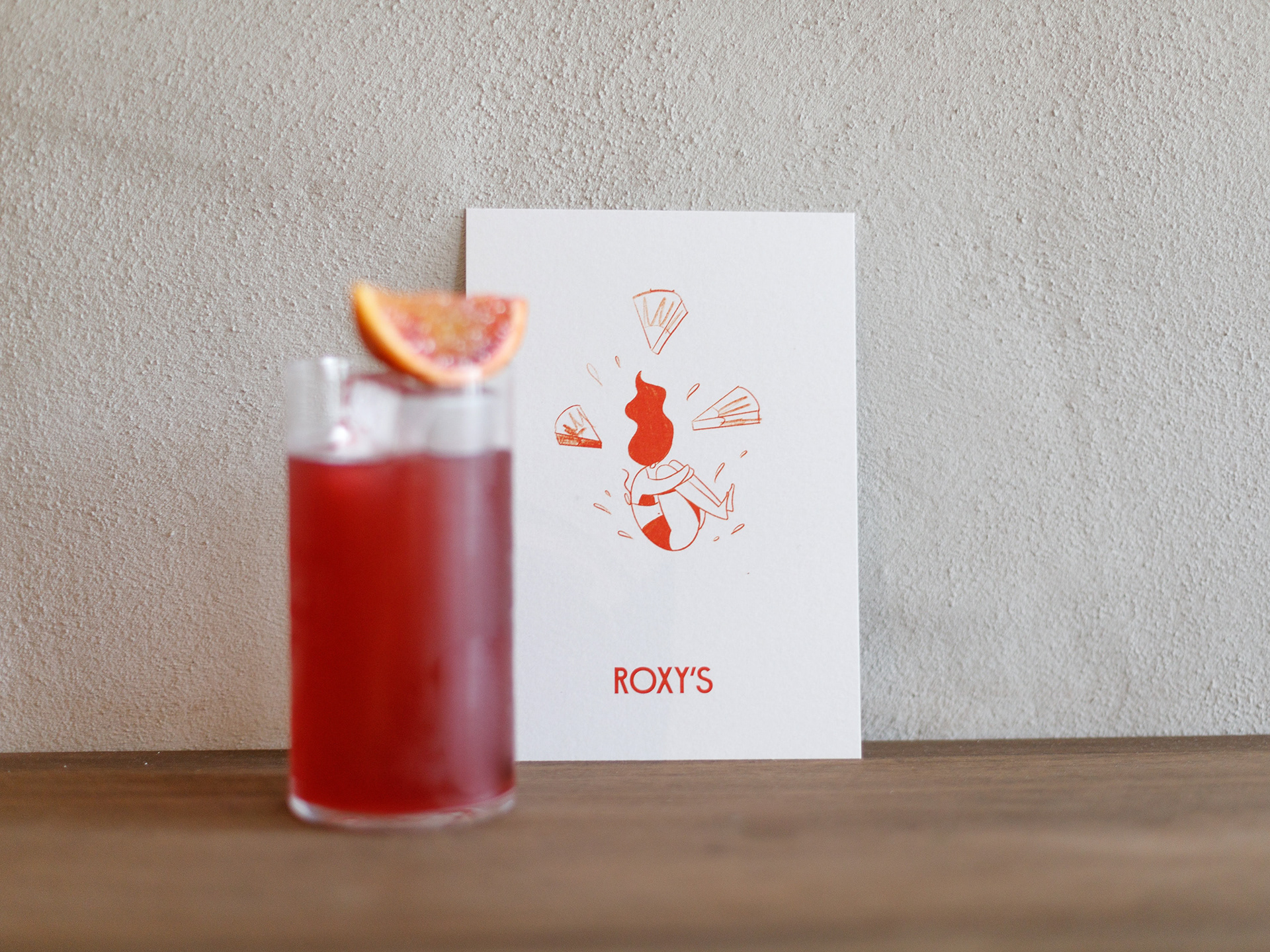
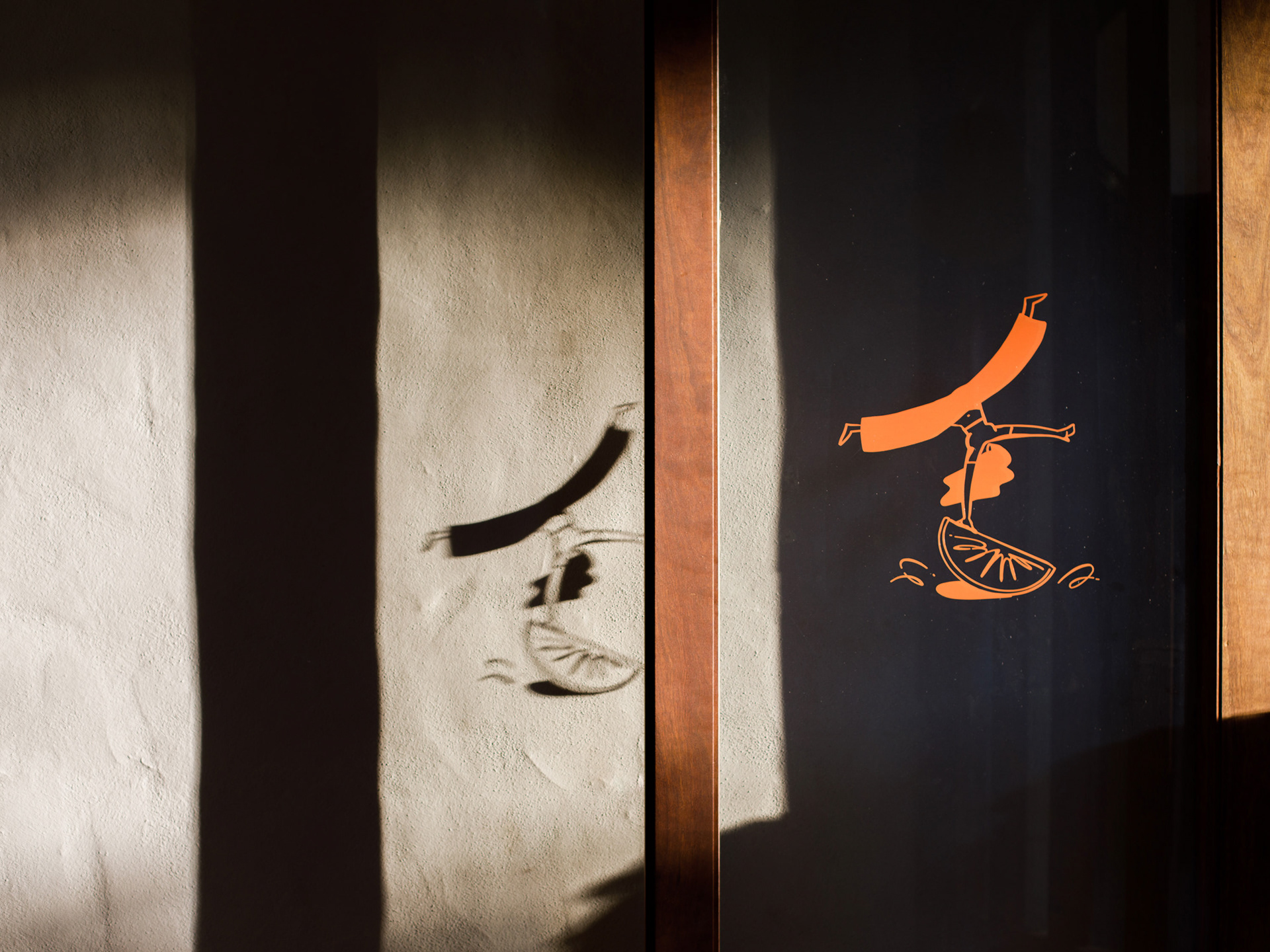
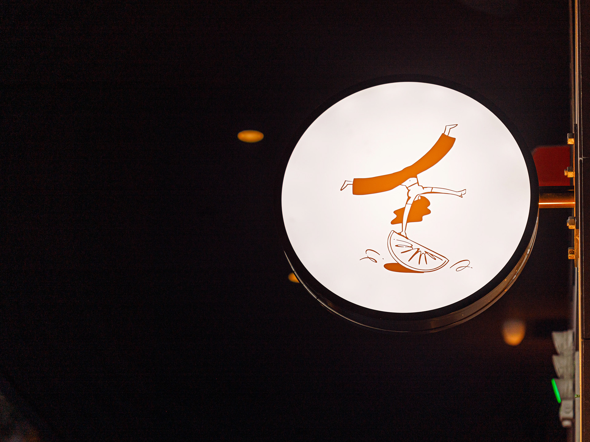
Just like Roxy herself, the Roxy’s brand is brimming with cheeky personality, infectious fun and smile-in-the-mind moments. The language is punchy and energetic, with a playful sprinkling of onomatopoeia. Reminiscent of rough pencil sketches, the illustration style is loose and raw. Yet the subject matter is always active with characters jumping, tossing and smashing larger-than-life produce–a kinetic visual treatment that captures the boundless energy of the venue, adults having fun. The colour palette centres around a solitary brand hue–‘Tomato’–allowing the vibrant food to shine through as the real hero of the Roxy’s experience.